We offer a comprehensive suite of services to cater to various aspects of a client’s needs.
Our expertise, as well as our passion for web design, sets us apart from other agencies.
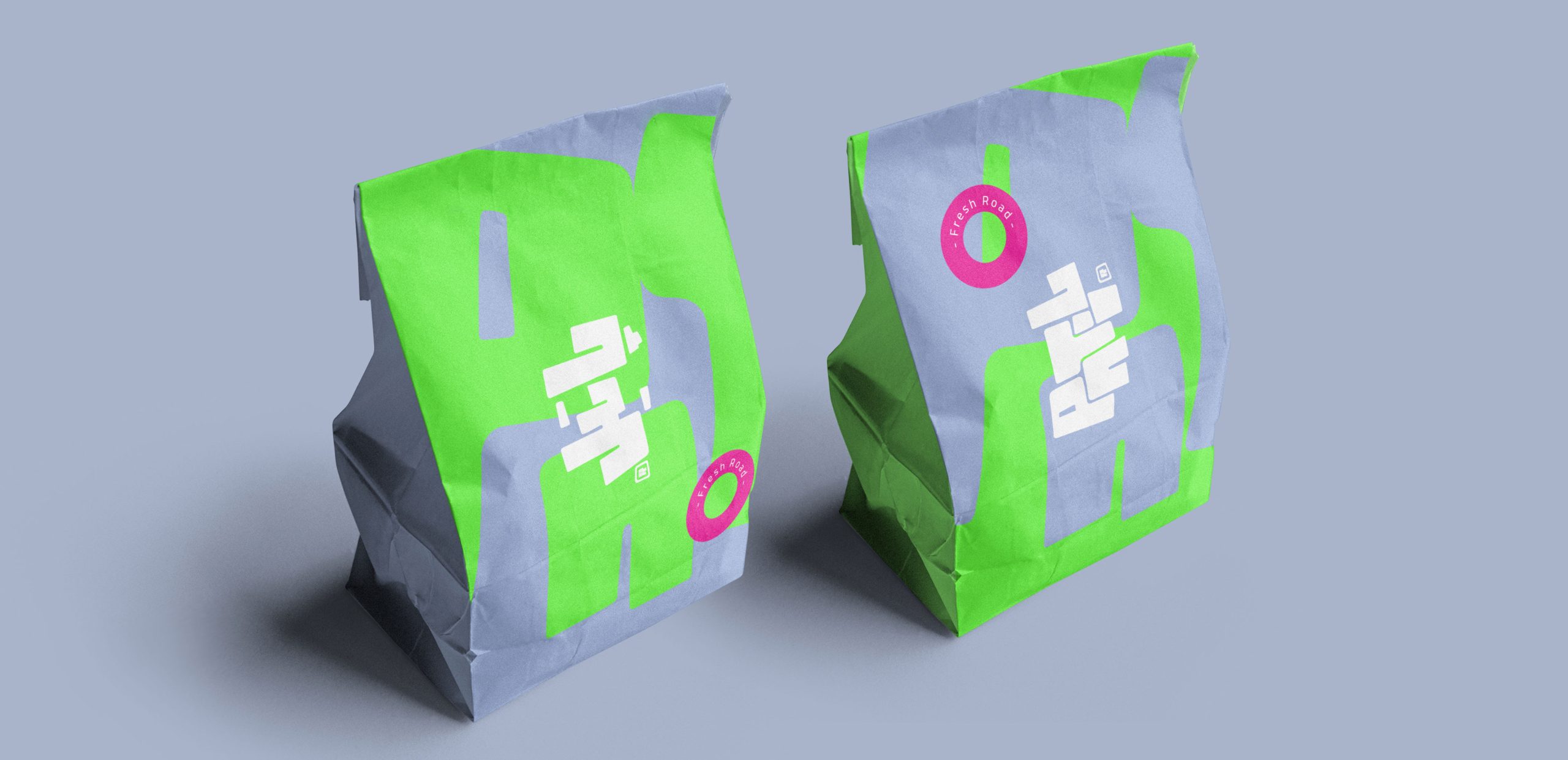
Patil is an adventurous and energetic brand that invites people to explore new flavors and exciting experiences. The name “Patil” has a dual meaning in colloquial language: it refers to traditional pots with a wide base and narrow opening, symbolizing discovery and depth, while also colloquially referring to someone who has indulged too much, representing fun and letting go. These two meanings shape the core identity of the Patil brand:

Exploration and Discovery: Just like the traditional Patil pot holds surprises within, our brand embodies curiosity and boldness, encouraging audiences to embrace new experiences.
Joy and Freedom: Patil represents moments of breaking free from the ordinary and truly enjoying life. We reflect this sense of liberation and excitement in our visual identity.
• Colors: A vibrant combination of phosphorescent green and lilac, creating a unique and eye-catching packaging style that conveys adventure and individuality.
• Typography: Bold and dynamic fonts that emphasize movement, energy, and curiosity.
• Patterns and Symbols: Inspired by the traditional shape of Patil pots, our design incorporates rounded forms and modern aesthetics to create a blend of nostalgia and contemporary style.
Patil’s Brand Personality
Patil is the companion that challenges you to step out of your comfort zone, explore, laugh, and celebrate life. Whether it’s an outdoor adventure or a lively night out, Patil is always by your side.
Brand Slogan:
Fresh Road – Inviting you to a journey of exploration and new flavors!